We create brands that are deeply connected to vision, rich with meaning, and crafted to inspire, align, and endure. Beautiful Brand Intelligence.
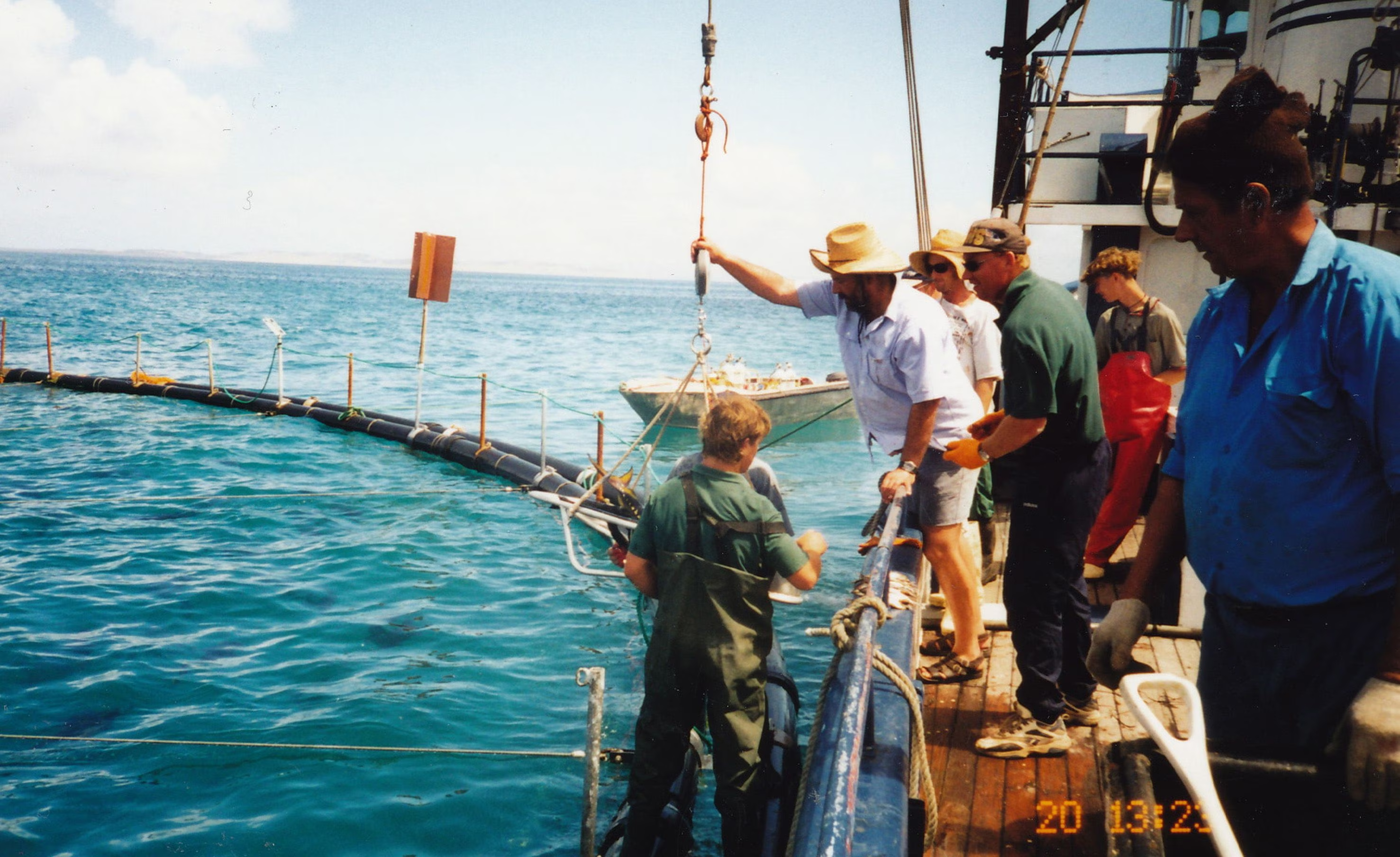
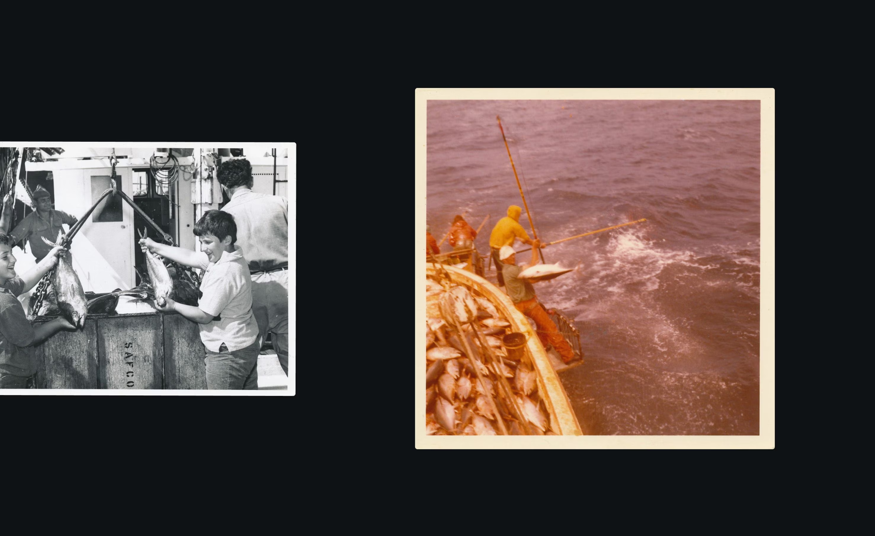
Most Australians think of tuna as canned, mass-produced, and cheap. But Southern Bluefin Tuna is none of those things. Prized in Japan and China as a delicacy, this ocean-caught treasure from southern Australia rivals the finest seafood in the world.
Kin’s founders set out to change local perception — reframing tuna not as a pantry staple, but as a premium, luxurious experience. Our role was to create a brand that could carry that weight. The result is a sophisticated, globally inspired identity that celebrates the beauty and value of a truly wild product.
Kin
Food & Beverage
Brand strategy
Brand identity
Website design
Signage
Spatial branding
Marketing collateral
Packaging


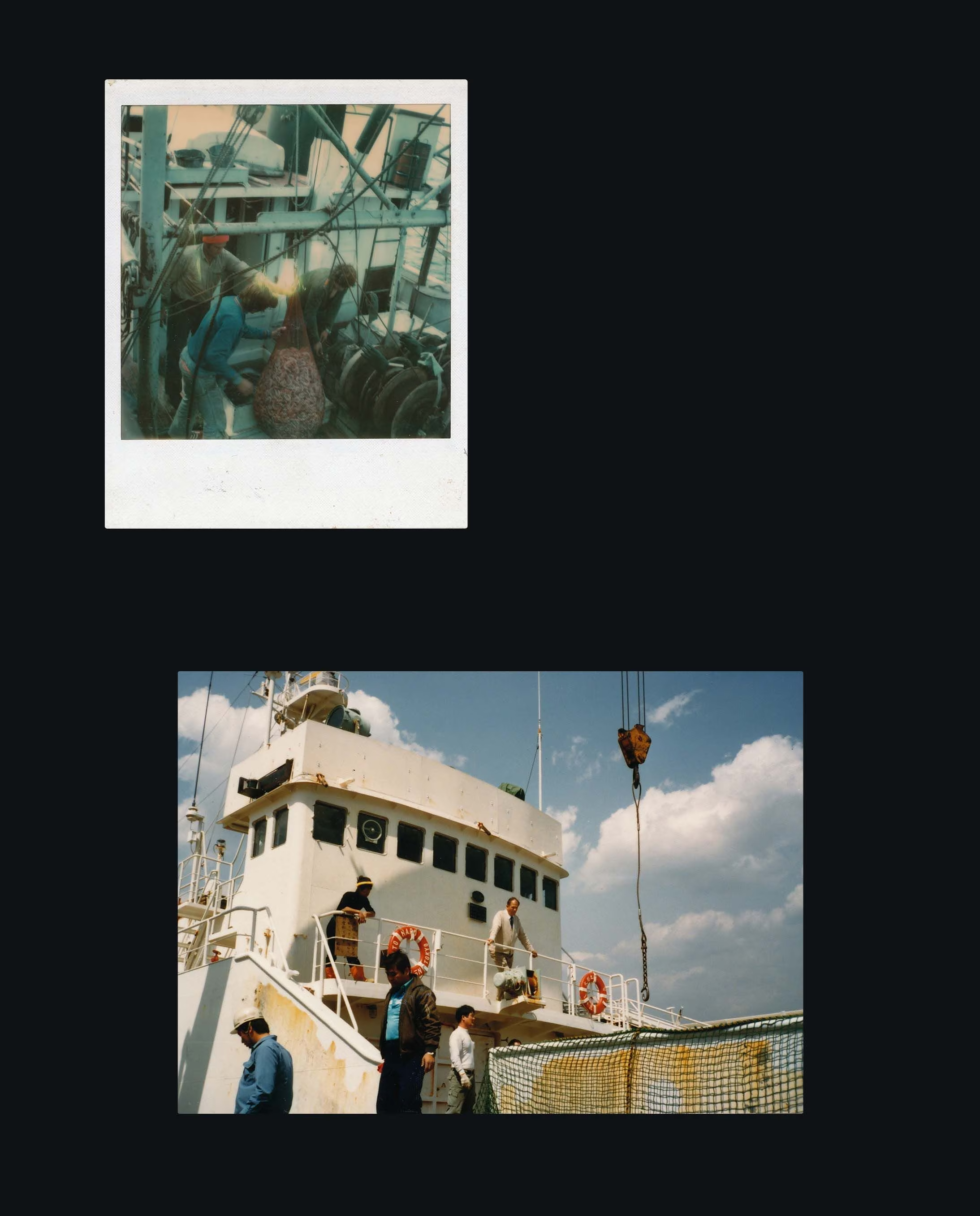

Tuna in Australia has a brand problem. Despite its prestige overseas, local consumers still associate it with $1.50 tins on supermarket shelves. Kin needed a complete repositioning— one that not only educated the market but elevated the entire category.
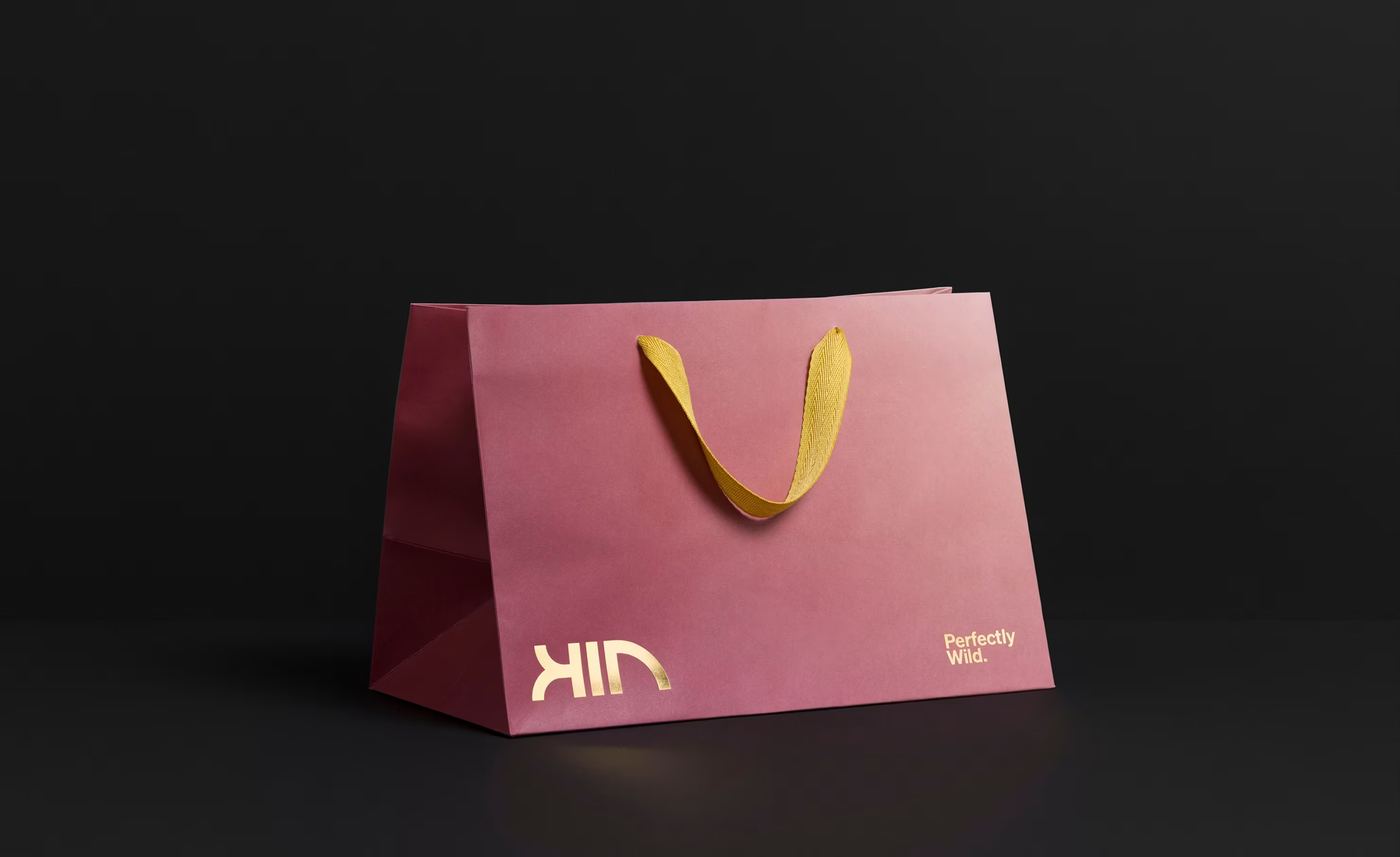
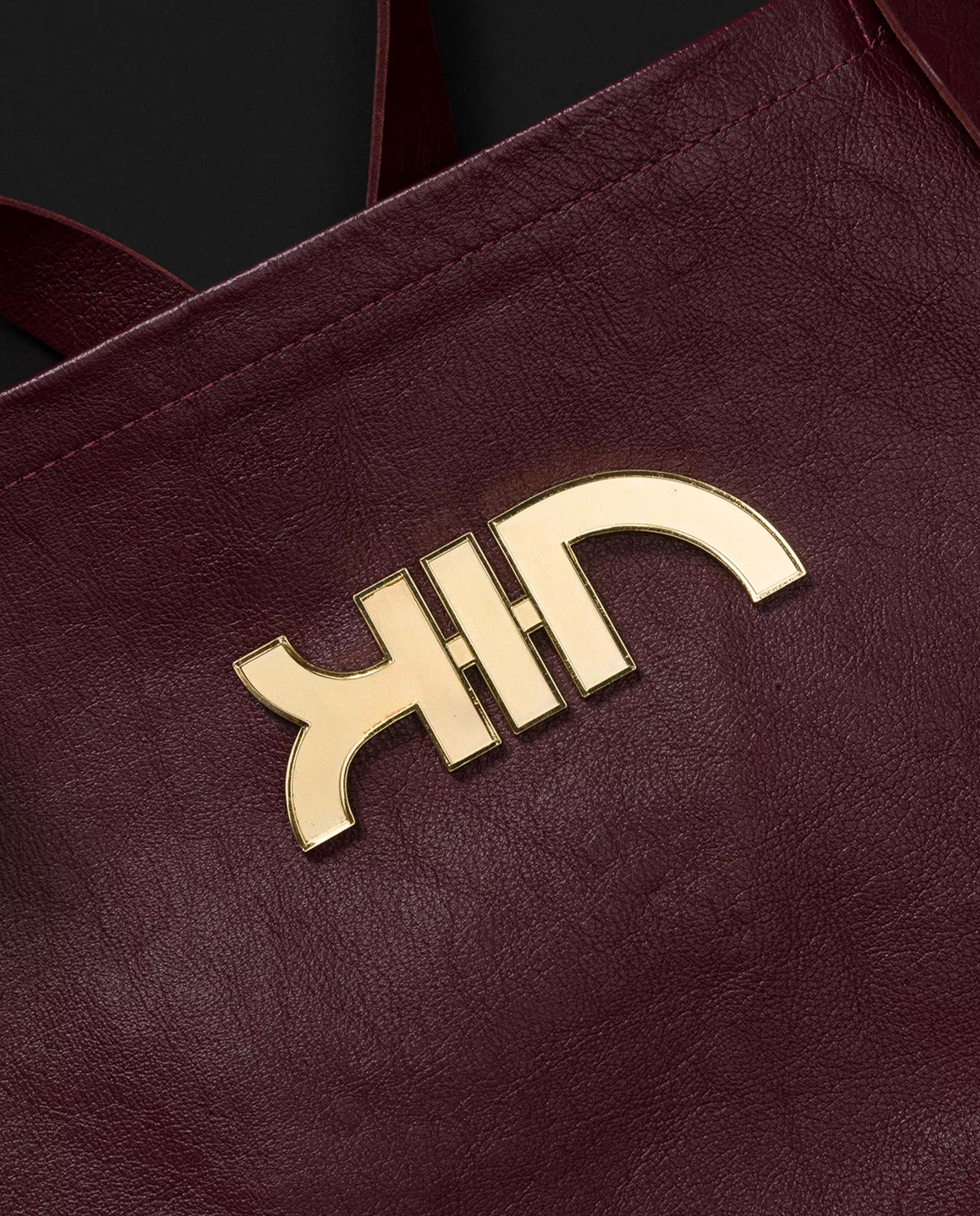
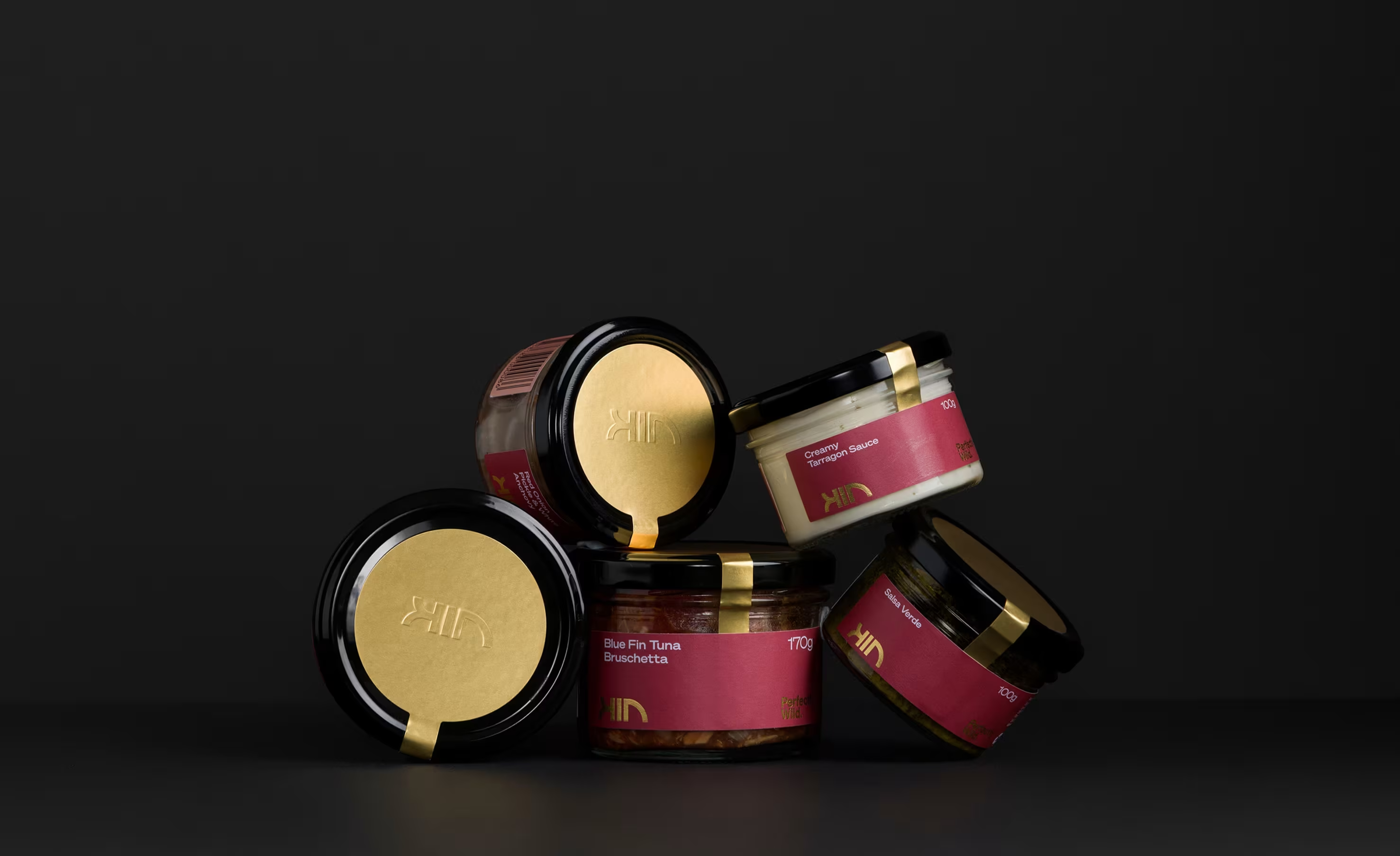
We drew on the cues of luxury fashion, premium spirits, and high-end gastronomy to reposition Kin as a modern icon of seafood excellence. The wordmark was crafted using the golden ratio — its form subtly echoing the curve of a fish. Our colour palette was inspired by the vibrant hues of akami, chutoro, and otoro — the three prized cuts of Southern Bluefin.
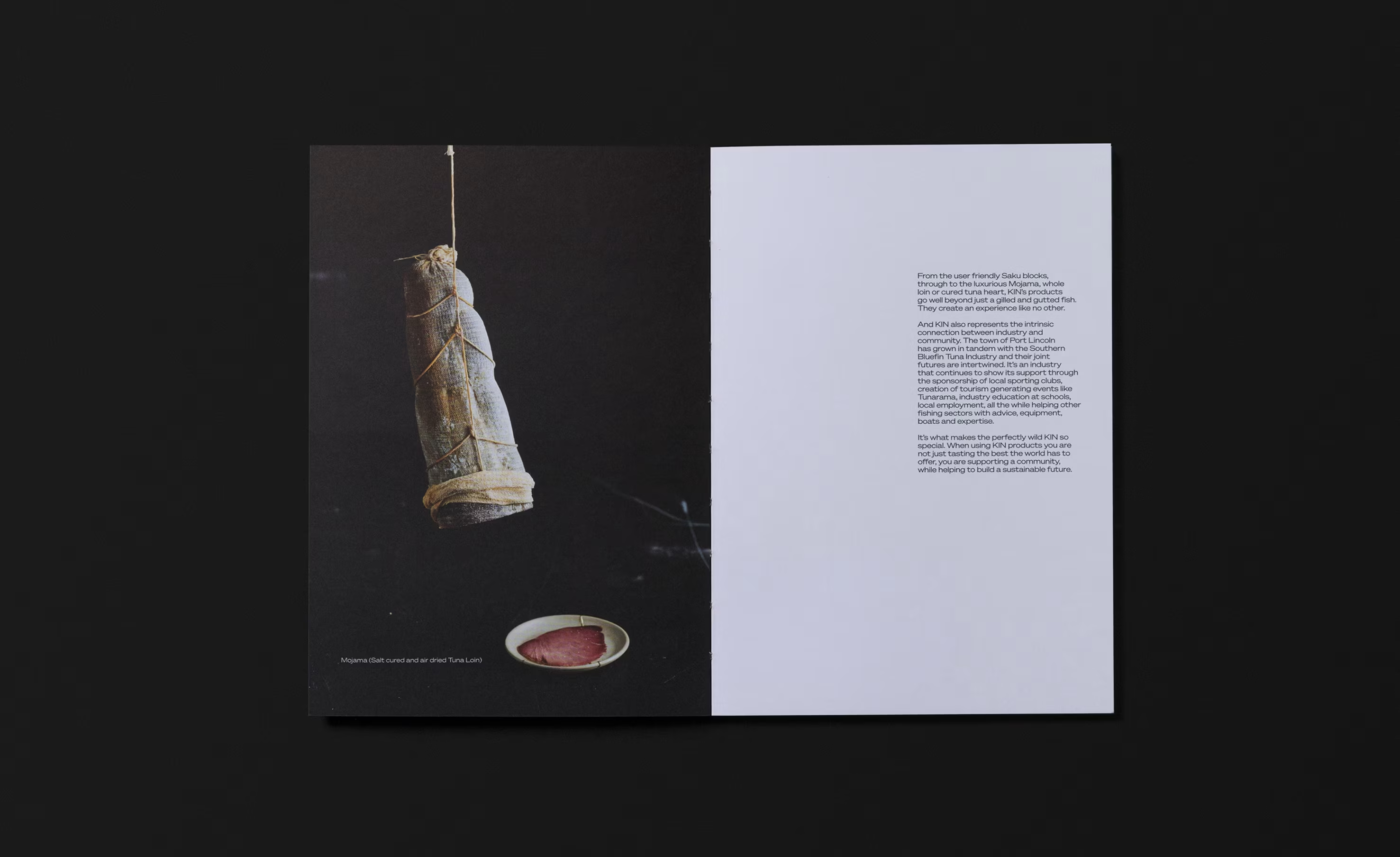
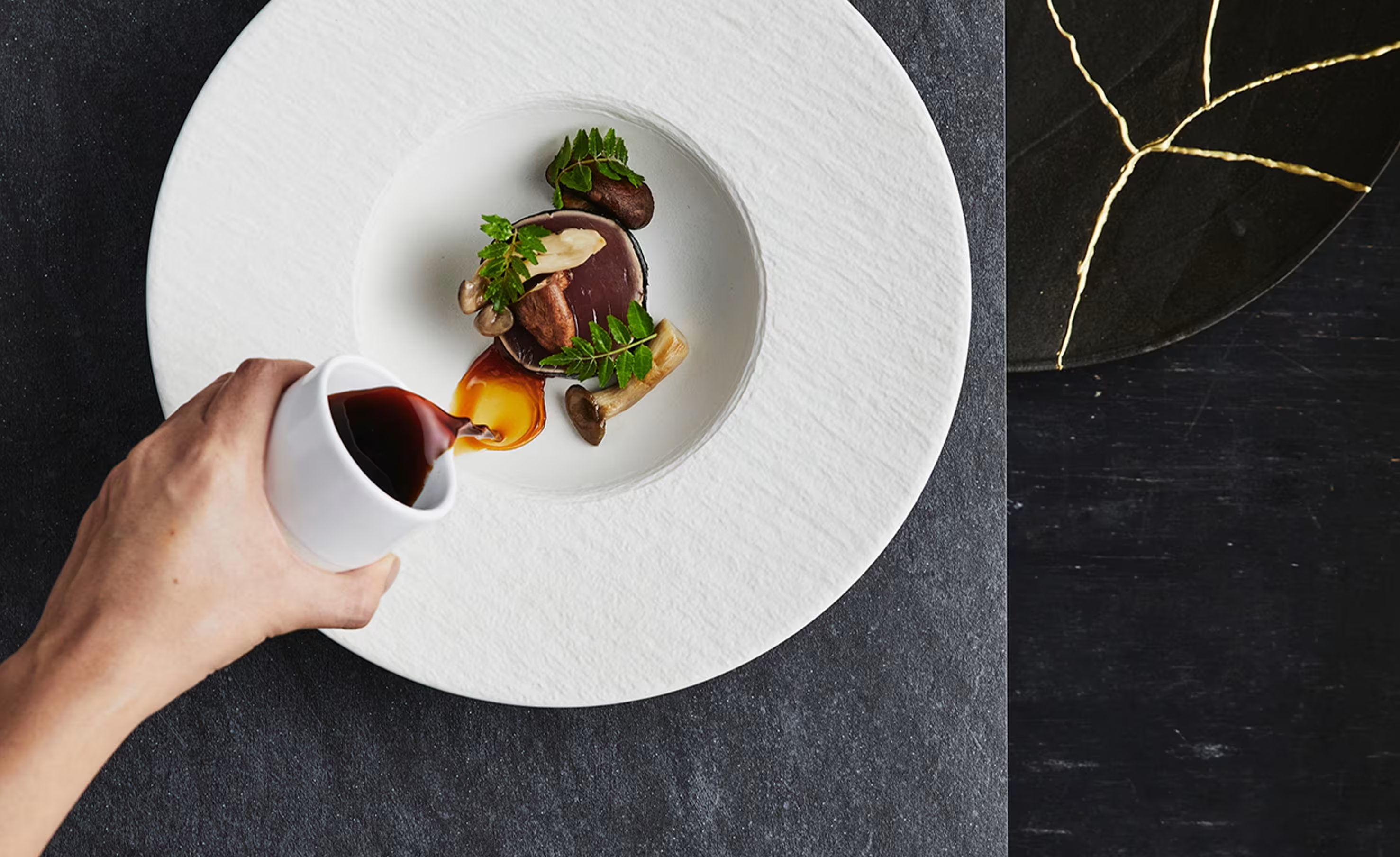
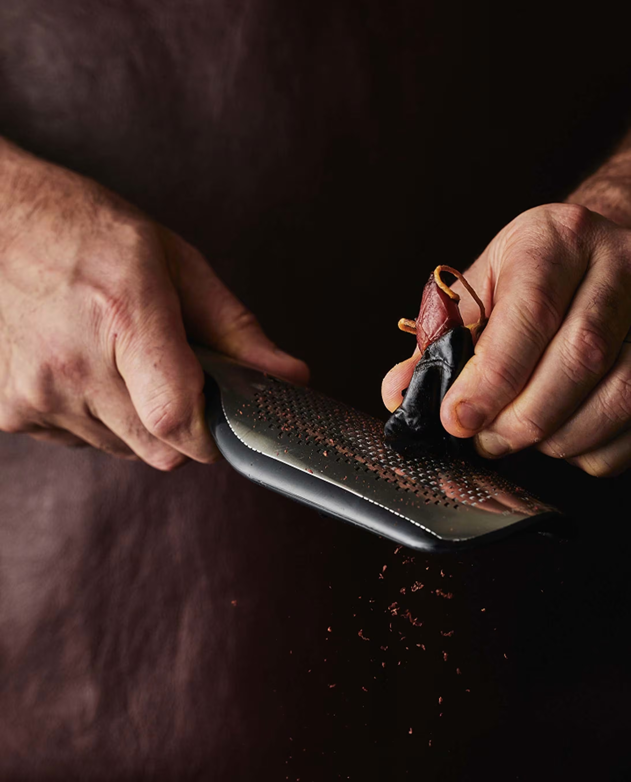
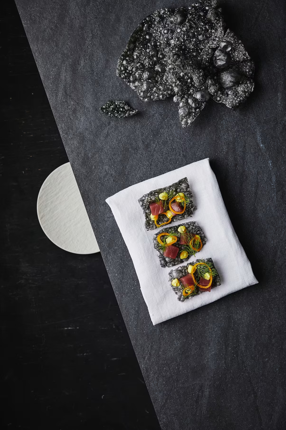
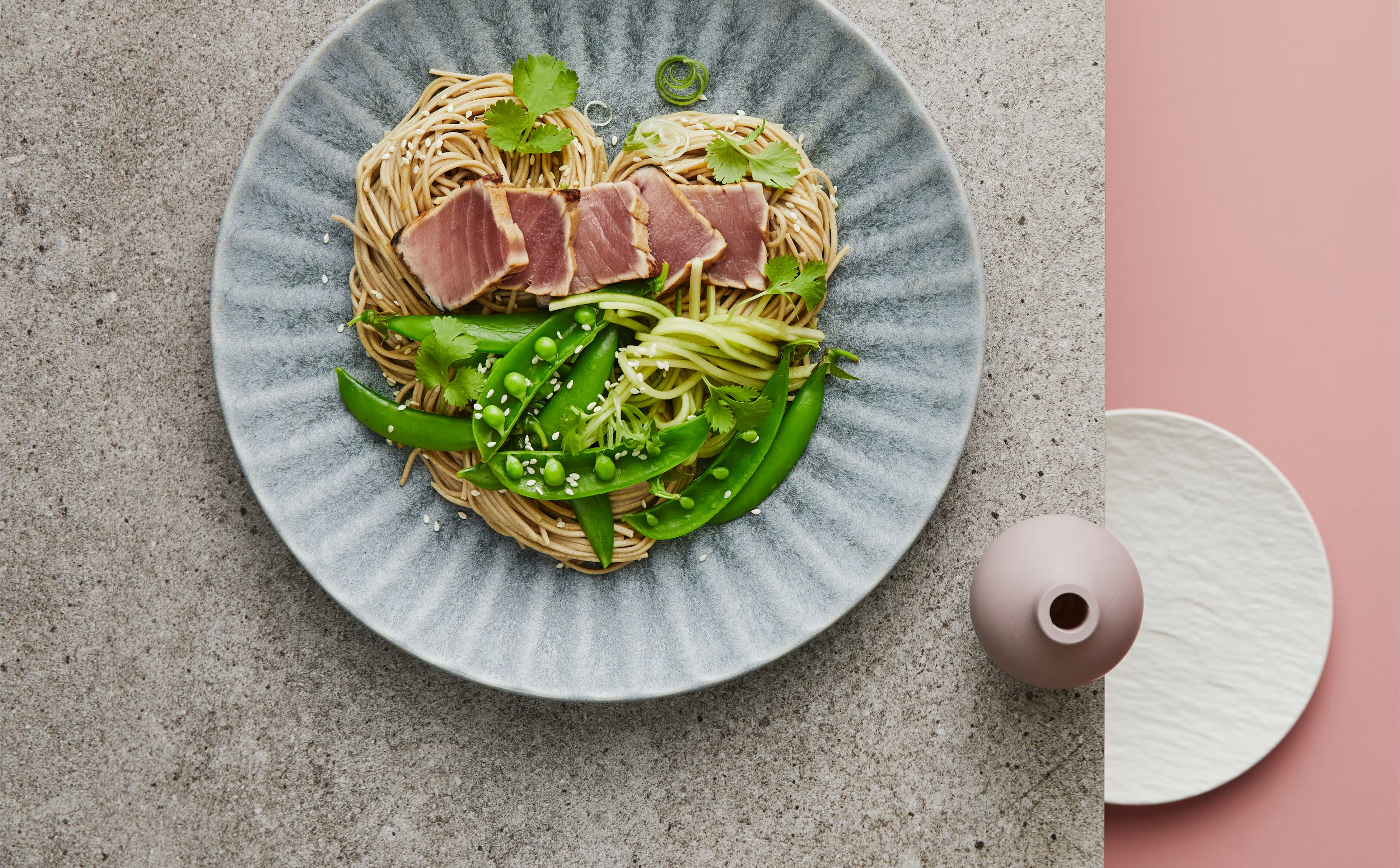
We worked closely with chefs and stylists to art direct photography that celebrated the fish like fine art, not food. The result is a brand that looks and feels rare, refined, and deeply rooted in craft.
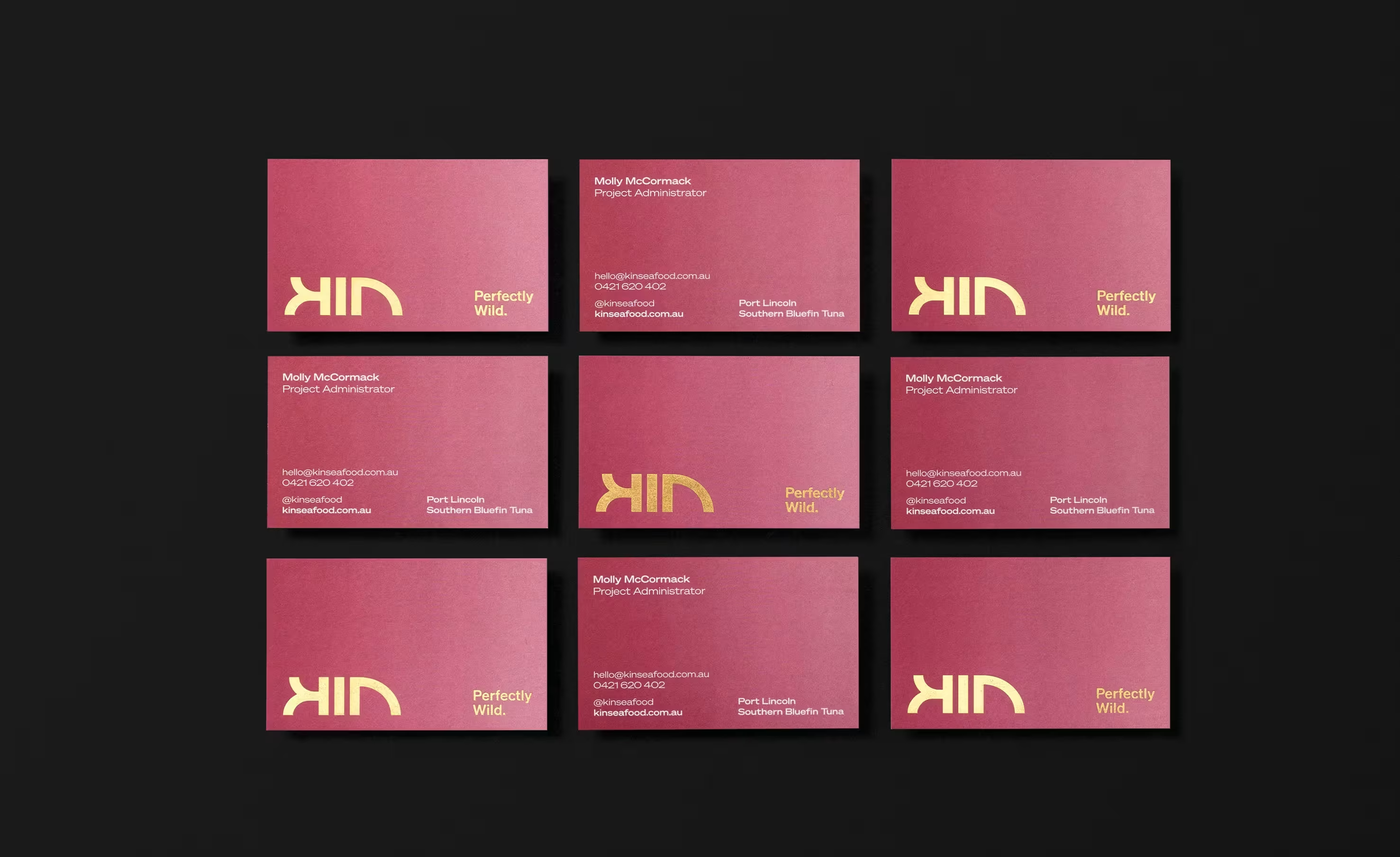
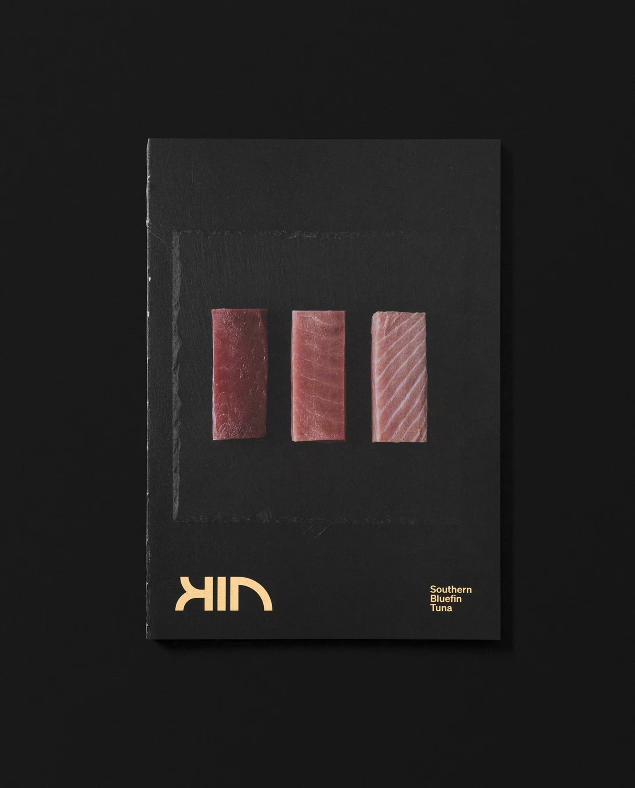
Kin celebrates the untamed origins of Southern Bluefin Tuna. Every detail of the brand—from the golden-ratio logotype to the blush-toned colour palette—tells the story of something rare, revered, and beautifully wild. This is seafood reimagined.
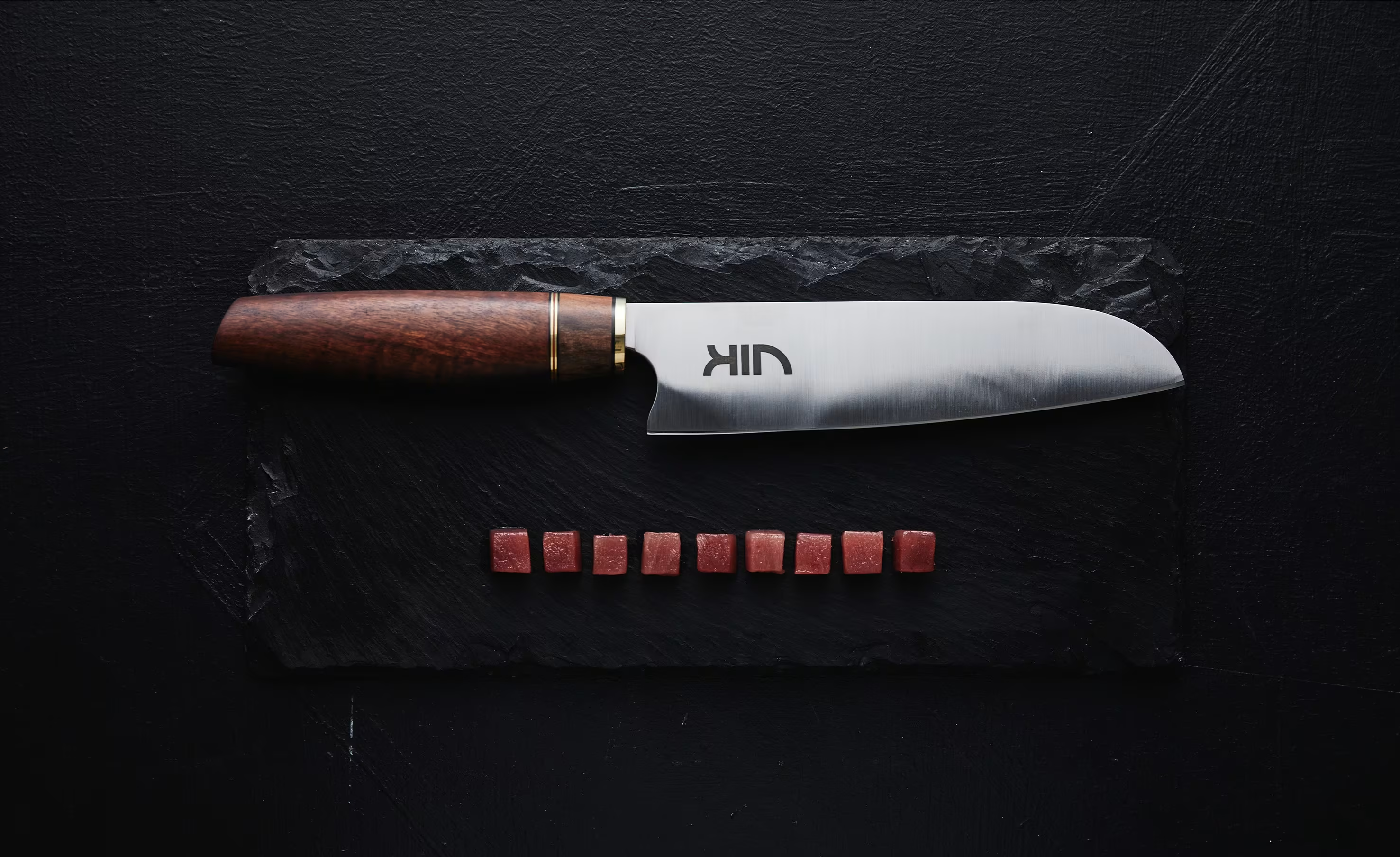
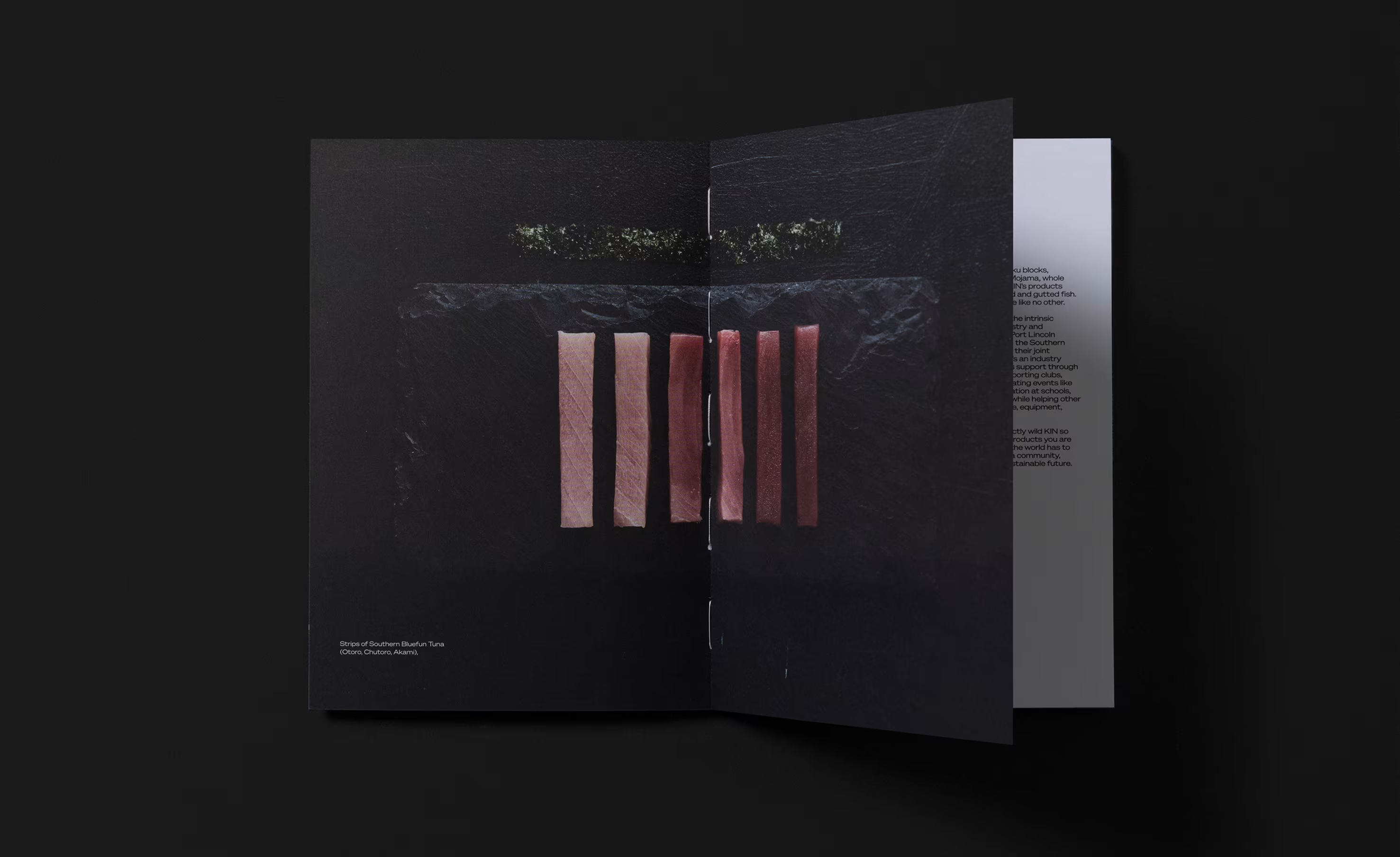
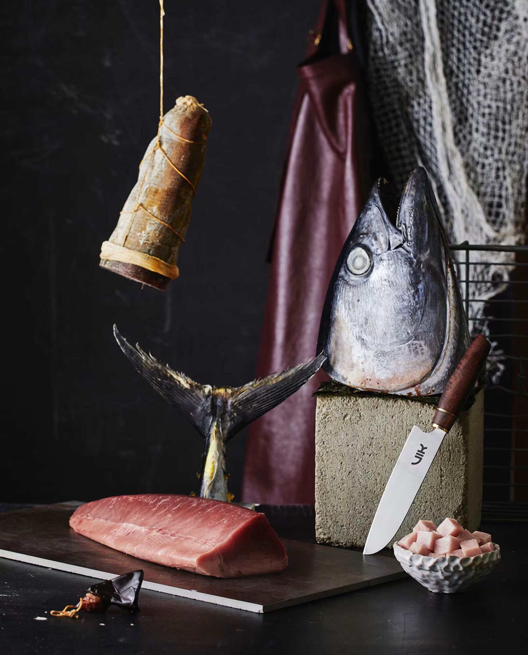
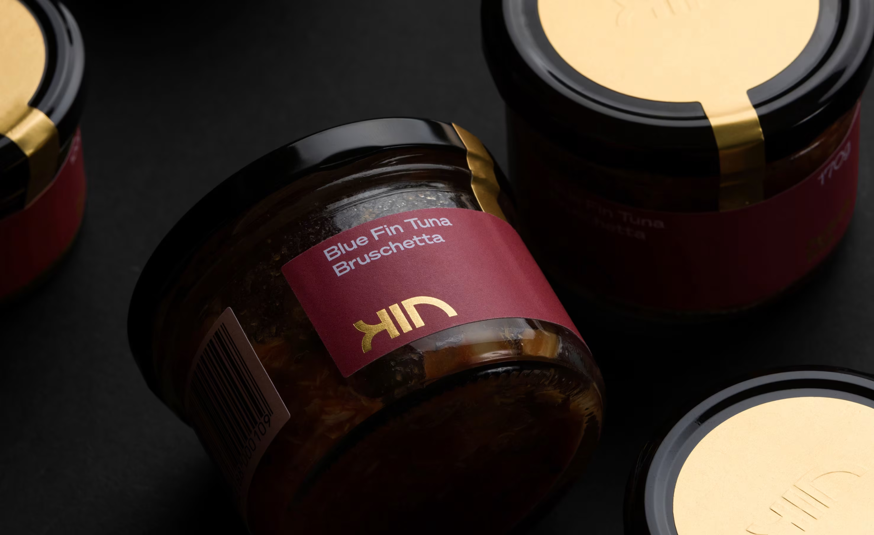
Our visual language puts Kin’s product on a pedestal — through stylised, art-directed photography that treats tuna with the reverence usually reserved for couture or caviar. The result is a brand that feels as premium as the product itself.
Ultimately, the brand reframes Southern Bluefin Tuna as a culinary luxury, elevating its story and restoring the value it deserves. By shifting perception and highlighting its rarity, provenance, and global significance, the brand helps Australians see the product for what it truly is — a premium, carefully sourced delicacy that stands alongside the world’s finest seafood.
Mark Lobo
Brendan Homan
Natalie Homan
D&AD Graphite Pencil
